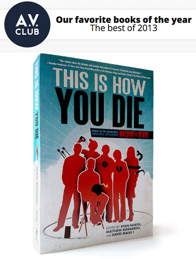
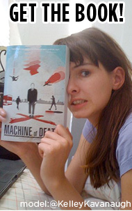
Earlier this week, we showed the THIS IS HOW YOU DIE short film (viewable here if you haven’t seen it) at a video showcase at the Westside Comedy Theater here in L.A. We won the night! Apparently it was a competition. Hooray!
I’ve asked the film’s director, Michael Mohan, to share some BEHIND THE SCENES THOUGHTS:

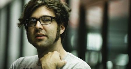
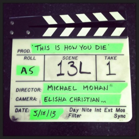
Hey there! Guest blogger Michael Mohan here. I had the great pleasure of directing the THIS IS HOW YOU DIE short film that you’ve probably already seen. (If you haven’t, watch it right now! Spoilers follow.) It was just so super fun to make, and for anyone who wanted a bit more insight into the filmmaking process, I wanted to write something up to give you a little peek behind the curtain.
But first — here’s the film:
BOOM.
The Concept
Okay, so we knew there’d never be able to capture the full breadth of emotional complexity that the stories in This Is How You Die contain in a mere 5 minutes, but we could play with the sense of expectation.

I feel like that’s one of the core things about finding out the method of how you’re going to die — if it were me, I’d never stop playing out all the different ways in which it might happen.
So here, we could not only play around with our characters’ expectations of their own deaths, and how their current lives are slightly impacted by knowing this news, but we could take it one step further, and play with our audiences’ expectations as well.
But ultimately, we just wanted it to be fun. Something that current fans would enjoy, and that maybe could help spread the word about the books to a whole new set of fans.
Visual Design
When figuring out the visual plan for This Is How You Die, I knew that each of these pieces had to function almost like a joke, where the reveal of the death worked in the same way a punchline does (or in the case of “Bear,” an anti-punchline). The setup to each joke had to be simple and clean.

So rather than doing any complex camera work, or making my directorial presence known, I knew the punchline would play best if I didn’t do anything to distract from the comedy. You know, if you think about the best comedy films, they’re always shot as simply as possible.
That said, I didn’t want it to be unspecific. My one complaint about so many comedies is that simplicity doesn’t mean that it has to look generic. And so here, I opted for a vaguely 1980’s horror vibe to guide our visual decisions.
I knew we could fully achieve that aesthetic for the limited budget, but also those films are, for the most part, very simply shot. It gives us just that little bit of texture to make it memorable, but not so much that it’s distracting. A few zooms here and there could help give it that retro self-aware sense of tension that’s also appropriate, but other than that I pretty much stayed out of the way.
“Purgatory Game Show”
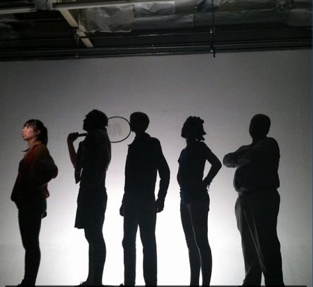
That’s what we called the little intro piece for each of these segments with the silhouettes and the spotlight. We weren’t sure if the short was going to be released as five separate clips or one long clip, and so this would not only give each of the pieces a sense of continuity, but also provide a visual table of contents of the order in which they should be watched.

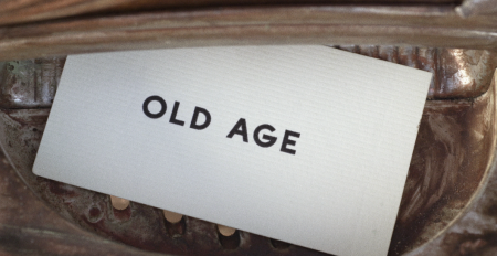
If you go back and watch it again, I especially love that with the first one, Old Age, our victim actually is able to read the words on the screen after they come up and her expression changes.
Old Age
The biggest challenge here was not the effects shot of our victim getting hit by the car, but rather the fact that there’s literally no dialogue. Our actor Anne Maddox had to convey quite a lot — the mystique of the machine, the fact that this machine is something that people take seriously, the trepidation of getting your prediction, and the relief when the prediction comes back as something seemingly good.

In screenwriting terms, this is merely “exposition” — but it’s a lot to accomplish with literally nothing but body language. But I knew that making sure this was super clear was the key towards actually understanding what this whole concept is about. It’s much harder than it looks, and I’m so glad we were working with such an experienced commercial actor as Anne, who understands the subtlety of such things.
The effects shot itself was really simple. We just hit Anne with the car. She’s OK now.
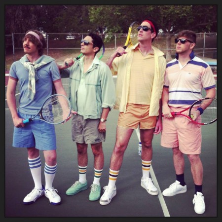
Parachute Failure
Here the goal was to just continue establishing the unexpected nature of a death prediction, and to do so incredibly quickly. This was always conceived to be the shortest one, and it clocks in at 23 seconds.

As for the effects shot — here’s how we did this. That final shot is composited from many different elements.
First off — our victim, Kevin Manwarren, was shot by himself: just saying his line, and then throwing his racket and falling to the ground. The hardest part here was making sure the tennis racket landed in a good spot.
Second off — we then had our parachutist, Jacob Womack, basically do a push up over him, capturing the frame right before he falls onto the ground and the frames after impact. We then opened his pack for the moment when the chute flies out of it.
Next, we took Kevin’s sock and shoe off and put it on a fake leg, and threw it in the air from the point of impact.
Next, we brought in the three guys, Shaun Boylan, Joey Greer, and Michael Wilkie, and set up a practical hydraulic blood cannon in the point of impact to spray fake blood onto the guys (and all over the tennis court).
No joke — after doing this we were promptly kicked out of this location. Blood was everywhere. And we just had to pack up and leave. No questions asked.
So we then moved to a nearby field and shot the parachutist against a green screen so he could be composited in the air falling from the sky onto the tennis player.

Mix all of these together, add more blood, a CGI parachute, and some cracks in the floor of the tennis court, and voila — Parachute Failure.
Hot Girl
The goal here was exactly the same as with Parachute Failure, to simply set up the game that we’re playing with the audience.

Now originally this was going to take place in that same location as the tennis court, and it was going to be a bit more surreal, with the model beautiful girl actually specifically hitting on the boy. But since we got kicked out of that location, we had to pick up those shots at a later date.
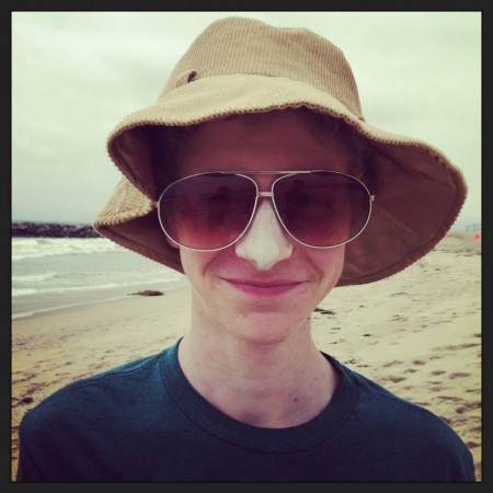
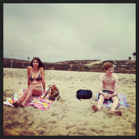
It was a blessing in disguise. One thing we all learned during this process was that the simplest ideas were the ones that won out. And here, we just needed to create the easiest milieu for this to take place in. We thought — how about a bright summer day at the beach? That’s where hot girls hang out, right? PERFECT. Also then the woman on fire — it’s slightly less random — she’s at least running towards a giant body of water.
Unfortunately, we ended up shooting on the coldest possible day in June at a grey overcast beach. No joke — it was FREEZING. In between takes, we would send the actors to their cars to blast the heat so they could warm up. In fact, you can see our actor Matthew Haddad actually physically shivering in one of the shots.

The beach was also directly west of the LAX airport, from which our poor sound mixer reminded us that there is an outgoing flight every 7 minutes.
But we got through it, and despite the fact that it’s not your prototypical beach, I’m really happy with how this turned out.
In terms of how we did the effects shot — we just lit our actor on fire. She’s OK now.
Time Travel
Ideally, now that we’ve established the trope of what these pieces are doing, we wanted to one-up ourselves. Pulling it off was not as easy.
For those of you not in the film industry — one of the biggest challenges with shooting lower-budget things in Los Angeles is finding locations. Everyone knows that when a film crew comes in, something’s inevitably going to get messed up or broken. People also know that most productions pay tons of money for locations, and don’t want to go through all the trouble for nothing.
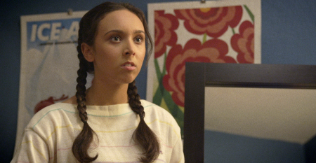
So this bedroom location was actually the hardest location for us to find in the whole shoot, and eventually we simply had to compromise. A friend of our producer graciously allowed us to take over her apartment for an afternoon. It wasn’t quite as big as we’d have preferred, but at least it had neat looking blue walls.

Unlike the beach, that room was sweltering. When you get six dudes and a bunch of hot lights in a room that small, you’re all right on top of each other. And while I would have preferred to just shoot normal coverage (medium shots and close-ups), I needed to give the illusion that the girls weren’t standing right next to each other, hence the mirror-tilt-up shots.
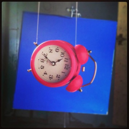
But the linchpin here is that slow-motion shot of the clock — which is, surprisingly, an effects shot. The room we were in was simply too small to shoot that practically: even if we moved the camera all the way to the very back corner of the room, when shooting on the kind of camera we shot on (a RED Scarlett), slow-motion shots require you to use less of the actual image sensor chip, cutting the amount of the room captured essentially in half.
So instead, we simply shot an empty plate shot of the wall with no clock, then separately shot a bluescreen of the clock just subtly dangling from a wire. The two were composited together.

But that one shot really is the indicator for the audience to wrongly think that “Time Travel” has something to do with the clock traveling through the air, and without it, I think the entire segment falls apart.
As for the effects shot with the Civil War — we just sent actor Nicole Lvova and our camera crew back in time. The camera crew made it back. Nicole, sadly, did not.
Bear
In a way, everything leading up to the “Bear” segment is a setup of its own to a very long anti-punchline. By this point, ideally, our audience realize that we’re playing a game with them, and now they’re trying to anticipate what the twist or trick is going to be.

For instance, many people I show the piece to think there was a typo on the card, and that it was supposed to read “Beer.” Then they anticipating the beer killing him. Amazing.
But ideally when you get to that shot of him opening the fridge, we really wanted the audience to (a) think a bear might jump out of the fridge, and then (b) feel silly for thinking that a bear might jump out of the fridge. If that happened to any of you, that makes us happy.
Our second day of shooting was comprised of the scenes in the domestic kitchen, as well as everything that took place in the woods. It was the first day on any shoot I’ve been on where literally NOTHING HAPPENED in any of the scenes. That’s the incredible thing about horror movies: once you establish a threat, the audience is on the edge of their seat, simply waiting for something to happen. That’s also why most horror movies are SUPER BORING the second time you watch them. (At least in my opinion.)
As for the effects shot with the bear coming out — this is where most of our money went. The bear is 100% CGI. But we had to bring in a real bear to be able to digitally map the texture of its fur. And then after studying grizzlies in the wild, actor Andy Serkis (uncredited) worked with Digital Domain for the motion capture. His performance, coupled with the digital CGI bear, is what created that movie magic.

The Music
One thing about the music. Prior to the shoot, I had this little melody stuck in my head. I would whistle it on set, and hum it in my head during certain takes. In prep, there were a few moments where we used a metronome to time lighting cues to the changing BPM of this imaginary song.
After returning some equipment on the last day, I swung by Guitar Center to see if I could actually play the melody on a synthesizer. If the song in my head could actually turn into a tangible actual song. Surprisingly, I was able to figure it out, so I videotaped my fingers on the keys by holding my phone in my mouth. Then came home and transcribed it. Below is what I sent to Hrishi, our composer. You can take the kid out of the marching band, but you can’t take the marching band out of the kid.

I really hope you enjoyed our film. If you have any questions about it, I can be found on Twitter at @michaelmohan or at facebook.com/michaelmohan. You can also catch my other work at michaelmohan.com.
Working with Malki and crew on this silly little short film, everyone really went the extra mile to make it as awesome as humanly possible, and I know that so much love and thought went into the book as well. If there’s any group of artists worth supporting it’s them. I’m really pleased to have been a part of it all!
Thanks for watching,
mm

FULL CREDITS BELOW:
Continue Reading »


